Clear information hierarchy
Help people understand the clinic and find the information relevant to them.
A dedicated alumni experience within Juvenile Caduceus Clinic’s website, bringing together alumni updates, connection opportunities, and the clinic newsletter.
Completed · #Include real client project
Juvenile Caduceus Clinic supports underserved youth through healthcare and community initiatives. Our team worked with JCC to create a website that communicated its mission, organized its information, and helped UC Davis students explore ways to get involved.
For the Alumni page, the goal was to give former members a place to see alumni updates and maintain their connection with the clinic.
A website bringing the clinic’s mission, history, committees, partnerships, and alumni information together.
The Alumni page: organizing its content and designing an experience for the community beyond current membership.
We clarified JCC’s audience, content needs, and priorities before designing. The brief emphasized simple navigation, organized committee information, and a clear presentation of the clinic’s history and work.
We also reviewed MinuteClinic, Winters Healthcare, and San Francisco Free Clinic to explore how other organizations presented their missions, resources, and contact information.
Team research · 3 clinic websites reviewed
Help people understand the clinic and find the information relevant to them.
Give important information and routes to contact a clear place in the experience.
Use a consistent visual language and an approachable tone across the site.
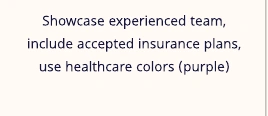
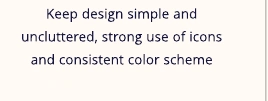
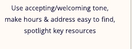
Selected considerations from the team’s competitive analysis · Demo Day deck, slide 9.
The team’s task flows mapped how alumni could reach highlights, newsletter information, and connection options. This gave the Alumni experience a place in the wider website before the visual design was finalized.
I designed the Alumni page as part of the larger JCC website. My focus was bringing alumni updates, ways to connect, and the clinic newsletter into a dedicated experience.
Bring alumni information into a dedicated page within the clinic website.
Use the early flow to frame updates, ways to reach out, and newsletter information.
The presented design leads with an alumni headline, a community photo, and Alumni and Connecting shortcuts.
The early sketch grouped the page into an introduction, alumni news, and alumni services. It explored how people could move from learning about the community to staying connected.
The final hero pairs the alumni introduction with a community photograph and clear Alumni and Connecting shortcuts.
The recorded prototype continues into Alumni News cards, a Share Your JCC Experience invitation, and a newsletter signup design.
Show what former members are doing and highlight the people behind the community.
Provide routes for visitors to reach out and maintain connections with alumni and the clinic.
Give alumni a way to stay informed about JCC’s ongoing work.
The presentation shows the upper page; the recorded prototype below continues into alumni news, sharing an experience, and the newsletter signup design.
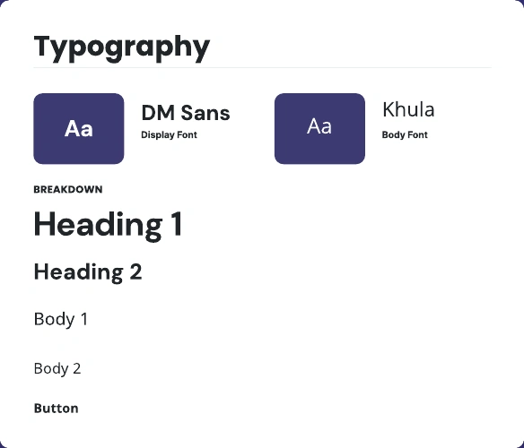
The Alumni page sits within the team’s shared design system, which established colors, typography, and interface styles across the website. This kept the page visually connected to JCC’s broader experience.
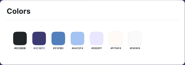
The system paired DM Sans for display text with Khula for body text. Purple and blue appear in the Alumni hero and its shortcuts, connecting my page to the rest of the clinic’s website.
Our team completed the JCC website project and presented the designs at #Include Demo Day. I contributed the Alumni page, creating a dedicated space for alumni updates, connection opportunities, and the clinic newsletter.
I’m grateful for the opportunity to work with our design teammates and leads, collaborate with the technical team, and create something for a real client.